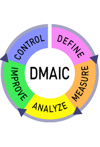
This is the second article on D2MAIC projects. The first article described the discovery and the define phase of the project. This article will describe the next two phases of D2MAIC: measure and analyse.
The define phase is followed by the MEASURE PHASE. This phase also has three goals: gaining a detailed understanding of the process, defining what metrics can be used to measure the capability of the process, and defining a system to collect and measuring the process capabilities. Tools that can be used during the measure phase are the value stream map (VSM), the metric selection table, and control charts.
Value stream mapping is a lean tool that can be used to map processes in detail, based on the both the flow of material and the flow of information. Data boxes make it possible to list important aspects of each process step, such as changeover times, cycle times and machine availability, which makes value stream mapping a great tool to use in (re)designing a value stream. In traditional lean initiatives, a current state value stream map is drawn first, after which a future state map can be designed. An example of a very simple value stream map is shown in figure 1.
More information about capturing the current state VSM can be found in the article about value stream mapping, and more information about improving the VSM can be found in the article about the 8 steps of future state value stream mapping.

Figure 1: example VSM
The value stream mapping should help the team in defining the correct metrics to measure the success of the project. When the VSM is done well, all important information of the process can be found in the data boxes, so the team can select the metrics based on these.
To close the loop with the previous phases of the project, a metric selection table can be created to link the metrics that were selected from the VSM to the CTQ’s from the customers defined earlier. An example of the metric selection table is shown in figure 2.

Figure 2: metric selection table
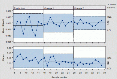
The control charts can be used to track performance on a selected metric. The control chart is a graphical visualization of the results of one metric, where a certain bandwidth of variation is allowed between an Upper Control Limit (UCL) and a Lower Control Limit (LCL). When the process is unstable, and acts outside these two limits, action is required in terms of analyzing the process criteria that led to this result. The control chart is visualized in the figure 3 below.

Figure 3: example control chart
After the measure phase comes the ANALYZE PHASE. This is the phase in which the data that is collected is used to find the root causes for the problems defined in the discovery and define phase. Tools that can be used in this phase are flow analysis and different root cause analysis techniques, such as the 5x Why and the Ishikawa diagram.
The main difference between the projects and the smaller A3 or practical problem solving is, that in these complex projects, root causes need to be validated using the measurement system defined in the measure phase.
The 5x Why analysis is a tool that helps you to continue question the possible cause of a problem to make sure you get to the root cause. In my personal opinion, the root cause can only be one of two possibilities: either there is a missing standard (or the standard is not correct) or the standard is not known to all that have to work with it. In both cases, it is clear what the countermeasure of the root cause should be: either you have to update or create the standard, or you have to train people in using it. Within technical projects, examples of standards that need to be set are machine settings, short interval control standards, or cleaning standards. Again, it is important to check whether the actions that derive from the countermeasures impact the metrics defined in the measure phase.
An example of the 5x why is described in the article about practical problem solving.
The Ishikawa diagram, also known as the fishbone, is brainstorming tool that can help identify possible root causes of a problem. When a simple 5 why analysis does not help you find the root cause, the project team can brainstorm possible causes using this structure, of which figure 9 is an example. Every bone of the fish represents one category of possible cause, and they are traditionally grouped in either 4 or 6 words that all start with “M”. in this example the fishbone diagram is also a 6M diagram, with the categories Measurement, Material, Machine, Mother Nature, Man Power and Method.

Figure 9: example Ishikawa diagram (fishbone diagram)
Measure and analyse are the third and fourth phase of a D2MAIC project. These are the phases which make the project fast based. Measures are selected to quantify the problem that is to be solved. The metrics are also used to validate improvements in the future. In the analysis phase, data is analysed to be able to set a direction for action. These actions will be described in part three of these series: the improve and control phase.
Continue to: